 Kudret Keskin
01
Product / UX review
When the product is live but friction and priorities are unclear.
You leave with Prioritized findings, improvement recommendations and an action frame.
Clear findings. A practical order of action.
I was the lead product designer on the Runibex team that built WAT Mobilite’s EV charging app. I led design for the driver app and the operational flows behind it.

A driver opens a charging app with one question: where can I charge right now, and will it work when I get there?
Our design research looked at how other charging apps answer that. The most common complaints were missing real-time information and screens so dense that the important part got lost. That set the direction for the whole product. Show live status clearly, and always tell the driver what to do next.
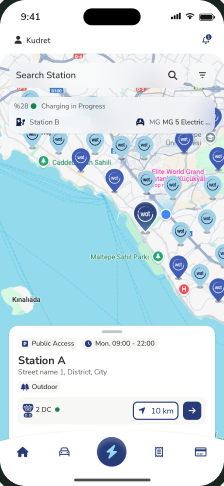
Drivers need to know which station is free and which connector fits their car before they drive there.
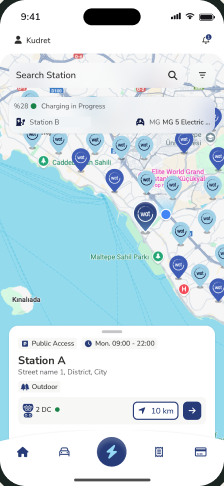
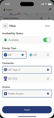
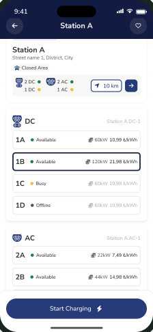
A map-first home screen with station cards, plus filters for availability, connector type and access. The station detail shows every connector’s status before you plug in.
A driver can choose a station with a free, compatible connector before setting off.

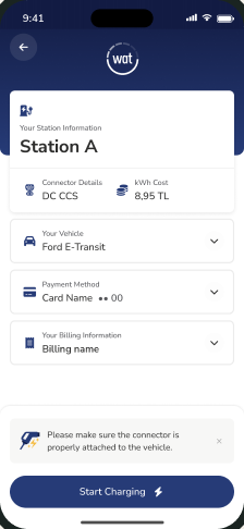
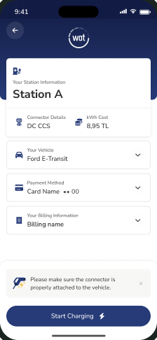
At the station, the vehicle, the card and the billing details all have to be right before a session can begin.
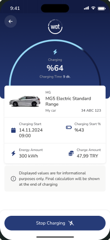
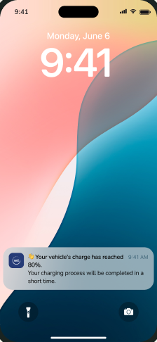
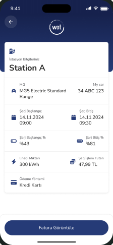
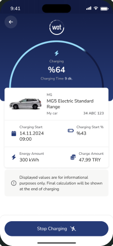
A start flow where you pick a connector and confirm vehicle, card and billing in one place. Then a live session screen built around one question, “How is my charge going?”, with progress updates on the lock screen. Live values are shown for information only, and the final amount is calculated when charging ends.
Drivers can walk away from the car and follow the session from their phone, knowing where the final cost will show up.


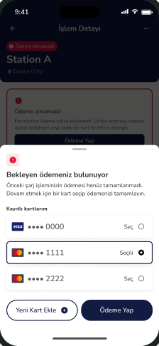
A payment can fail after the energy has already been delivered. If the app only shows an error, the driver is stuck and the session stays unpaid.
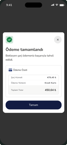
A recovery flow based on one rule from our design notes: when a payment fails, the driver is never left without a next step. Saved cards allow a quick retry, and a new card can be added in the same flow. After repeated failures the app offers clearer options: a different card, paying later, or contacting support. We renamed the button from the system term “Trigger payment” to “Make payment”. When the payment goes through, the app takes the driver back to where they were instead of leaving them on an empty success screen.
A failed payment became a short detour in the flow instead of a dead end.

From the map to the right charger.
The driver can see how the charge is going without asking anyone.
Every failure has a next step.
Screens were one part of the job. Most of the work happened in how the team planned, decided and handed off.

screens, components, user flows and design handoff

workshops and early mapping with the team

sprint planning and tracking design work

daily work with product and engineering

This was a team effort, and I’m proud to have been part of the Runibex team. While the old platform kept more than 700 stations running, we built the new system behind it and took it live without the network going offline. Thank you, Runibex, for the trust and the great management.
Products that have to work outside the office: in the field, at a station, at a counter, with real users and real operations behind the screen. WAT Mobilite is one example. I’ve spent about twenty years in product and system design, most recently in fintech, mobility and field operations.
No. I was the lead product designer on the Runibex team that built the app for WAT Mobilite. I led design for the driver app and the operational flows behind it, and worked daily with product and engineering.
Yes. WAT Mobilite Şarj is live on the App Store. View on the App Store
The app was built for drivers in Turkey. The payment screens are shown as they are, with English subtitles.
Screens are one part of it. I also map the flows, write down the rules for edge cases like a failed payment, and hand off work engineers can build from. That’s where most of the hard decisions are.
Yes. On WAT Mobilite we built the new system while the old platform kept more than 700 stations running, and took it live without the network going offline. Working next to a live product is normal for me.
I work remotely in English and Turkish.
You tell me about the product, the team and the problem. I reply with the most useful next step. That can be a short focused piece of work or a longer engagement. Scope, timing and fee are agreed together before we begin.
The 10-day MVP is $2,490, and POC to live in six weeks is $7,490. Prices are in USD and exclude VAT.
What the product does, who uses it, where it breaks today, and when you need it fixed. Rough notes are fine.
Work together
Start with the problem. We’ll shape the right scope together.
Tell me about your projectWhen the product is live but friction and priorities are unclear.
You leave with Prioritized findings, improvement recommendations and an action frame.
Clear findings. A practical order of action.
When a new feature or an existing experience needs a concrete design solution.
You leave with A clear problem and user, then the flows, the prototype and the screens you decide on.
A focused direction you can review and test.
When several products or continuous development need senior product and design support.
You leave with Priorities, design decisions, critical flows and the design system, at the team’s rhythm.
In the work, at the team’s rhythm.