 Kudret Keskin
Fintech product
Next-gen fintech experience
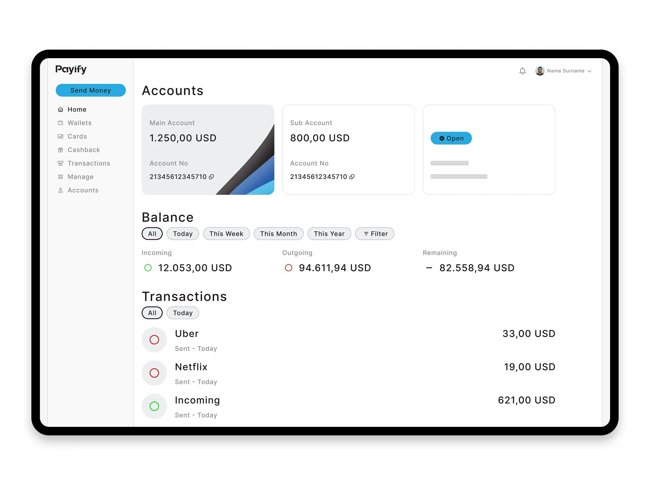
Payify is a fintech platform for personal finance and a digital wallet. It was designed from scratch: plain, scalable, and secure.
For personal finance and a digital wallet.
- Client
- Linktera
- Period
- 12 weeks
- Services
- UX/UI design, prototyping, marketing site, mobile and portal

Role
Solo, end to end.
This was a solo project. I led the UX and UI from end to end, including onboarding, transaction flows, and KYC.
The product was a white-label solution tailored for Linktera.
- UX research and user flow mapping
- Design system
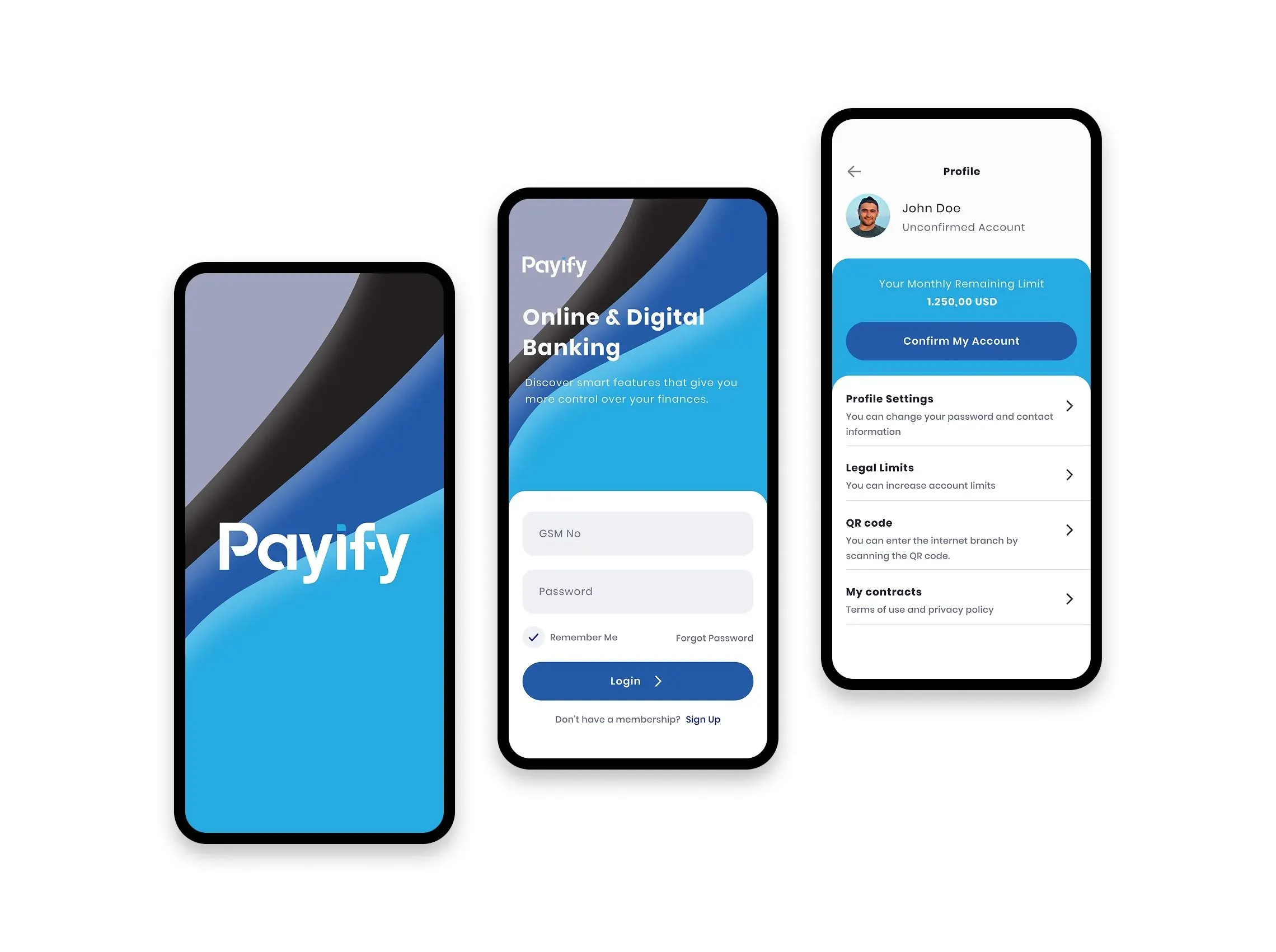
- Web portal and mobile app design
- Brand and visual identity
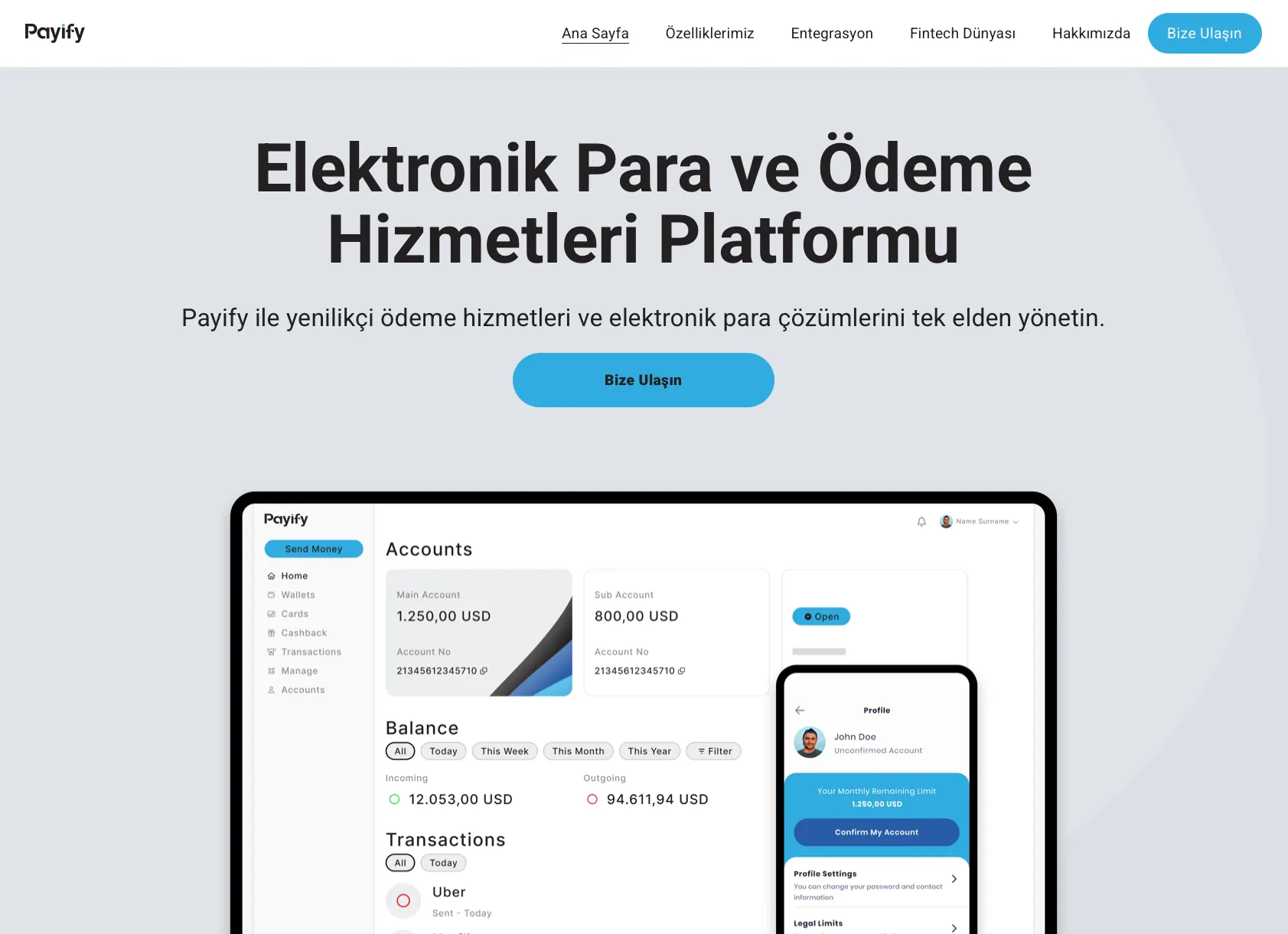
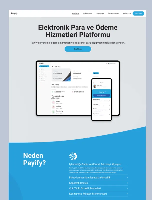
- Marketing site design
Problem
Trust from the first screen.
The challenge was a financial product that feels modern, secure, and intuitive from the first touchpoint.
Trust, speed, and clarity had to be present on every screen, especially in onboarding and transactions.
Approach
Compliance, with less friction.
The work reduced friction while meeting fintech compliance. People could understand the product and start using it right away.
KYC and transaction limits sat in a minimal, user-first interface.
Output
An MVP in 12 weeks.
The MVP was delivered in 12 weeks. It included the flows, the UI components, and a small design system so the product could scale later.
The work covered the web portal, the mobile app, the brand and visual identity, and the marketing site.
It later became part of a broader financial ecosystem supported by a ₺100M investment.
Story
A 5-year design partnership.
Linktera is a long-term partner. On this work I am the design and product partner. The design partnership has run for 5 years. See the Linktera design partnership.
An earlier fintech product, RubikPara, set the approach to simplicity, data clarity, and the design language on Payify.
Earlier work with HSBC, Yapı Kredi, and Visa showed the operational realities and expectations of financial platforms.
Marketing site
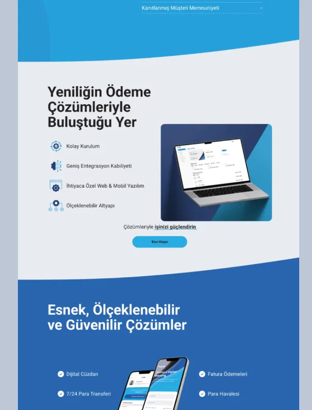
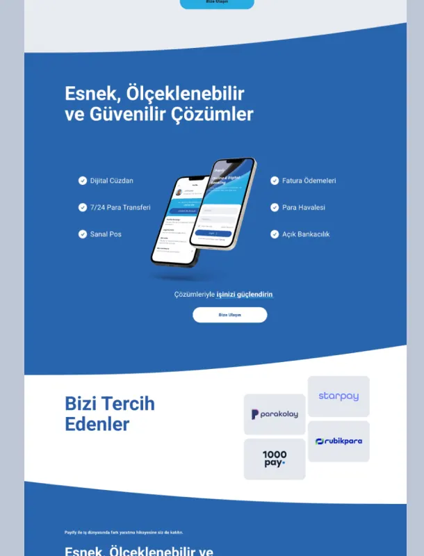
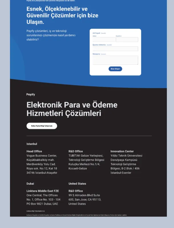
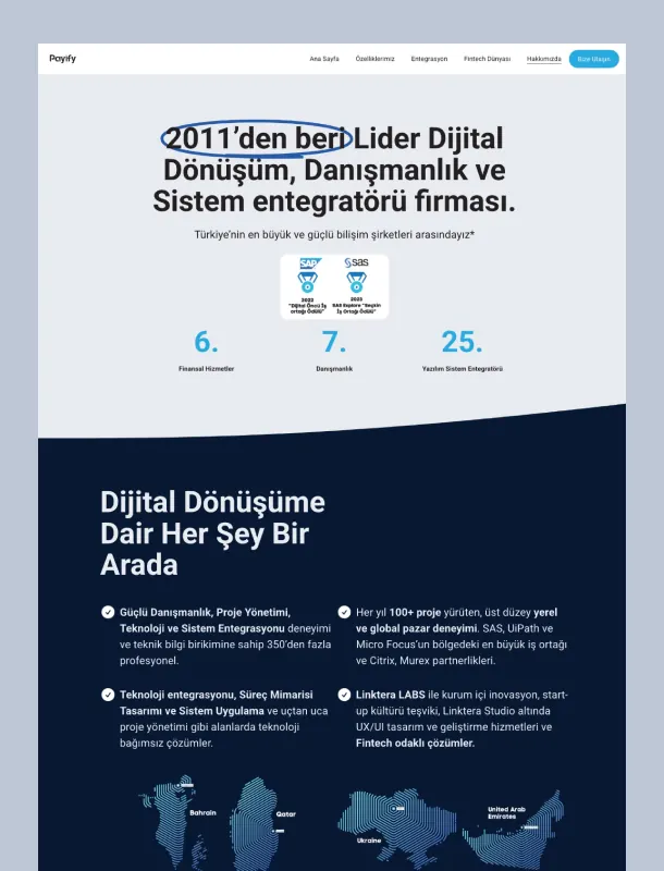
A site for early interest.
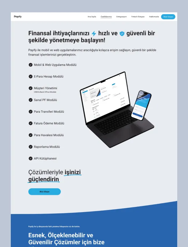
The marketing site was built on Squarespace, so it could go up quickly and stay on brand. Custom styling and layout carried the product tone and visual identity.
It was mobile-first and built for conversion. Clear structure guided visitors toward sign-up and the contact form.
Analytics, a light CMS, and an SEO-ready setup made it a practical place to gather early interest and test market fit.
- Landing page design
- Mobile optimization
- Site setup
- Light SEO
- Launch and handoff
How we worked
Remote, through launch.
From kickoff to launch, the work stayed remote and async-friendly. Daily discussion, iterative feedback, and cross-functional collaboration kept the team aligned.
Questions
Short answers.
If you want a product designed from the first screen through launch, a short note is enough.
Let's talkWhat made the Payify UX approach different for a fintech MVP?
It placed strict compliance flows, including KYC and transaction limits, in a minimal interface. That shortened the learning curve and made the product clear from the first day.
How fast was the product brought to life?
The MVP was delivered in 12 weeks, including the flows, the UI components, and a small design system built so the product could scale later.
Work together
If you want a product designed from the first screen through launch, a short note is enough.
You can also write from the work-together page. Work together