Effective Branding for Financial Analytics Solutions
The Brief
Overview: It is a tool to be used to evaluate the commercial loan applications of banks. This tool analyzes the financial health of businesses and helps calculate risk before lending.
Tagline: “Advanced Analytics for Connected Data” - “Data-Driven Credit Score” - “Make the Right Decisions with Your Financial Data” - “Automated Data-Driven Decisions” - “The Future of Financial Reporting and Analysis”
Deliverables for the project:
Color Psychology · Typography · Iconography · LogoColor Connections: RateLink's Emotionally Resonant Palette and the Psychology Behind Its Impact
Colors possess the power to evoke a wide range of emotions and perceptions, playing a crucial role in shaping a brand's identity and overall impact. In crafting RateLink's visual identity, the chosen colors were selected for their specific psychological meanings and effects, ensuring a cohesive and emotionally resonant brand experience.
Indigo Blue: As the main color of RateLink's logo, indigo blue is often associated with professionalism, credibility, and stability. This color is commonly used in the financial sector, instilling a sense of trust and reliability in potential clients.
Cerulean Blue: This vibrant shade of blue complements the primary indigo blue, adding an element of energy and dynamism to the brand identity. Cerulean blue is known to evoke feelings of clarity, innovation, and inspiration, highlighting RateLink's commitment to cutting-edge analytics solutions.
Slate Gray: As an auxiliary color, slate gray provides a solid foundation for the overall color scheme, conveying a sense of strength, balance, and sophistication. This neutral hue enhances the perception of RateLink as a dependable and established player in the financial analytics industry.
By understanding and leveraging the psychological meanings and effects of these carefully chosen colors, RateLink's brand identity projects an image of trustworthiness, innovation, and expertise. The harmonious interplay of indigo blue, cerulean blue, and slate gray creates a visually engaging and emotionally resonant experience that resonates with the target audience and supports the brand's core values and objectives.

Indigo blue evokes seriousness, reliability and dignity. This color is also associated with intelligence, power and leadership. In the financial industry, indigo blue is often used to reflect a sense of professionalism and reliability.
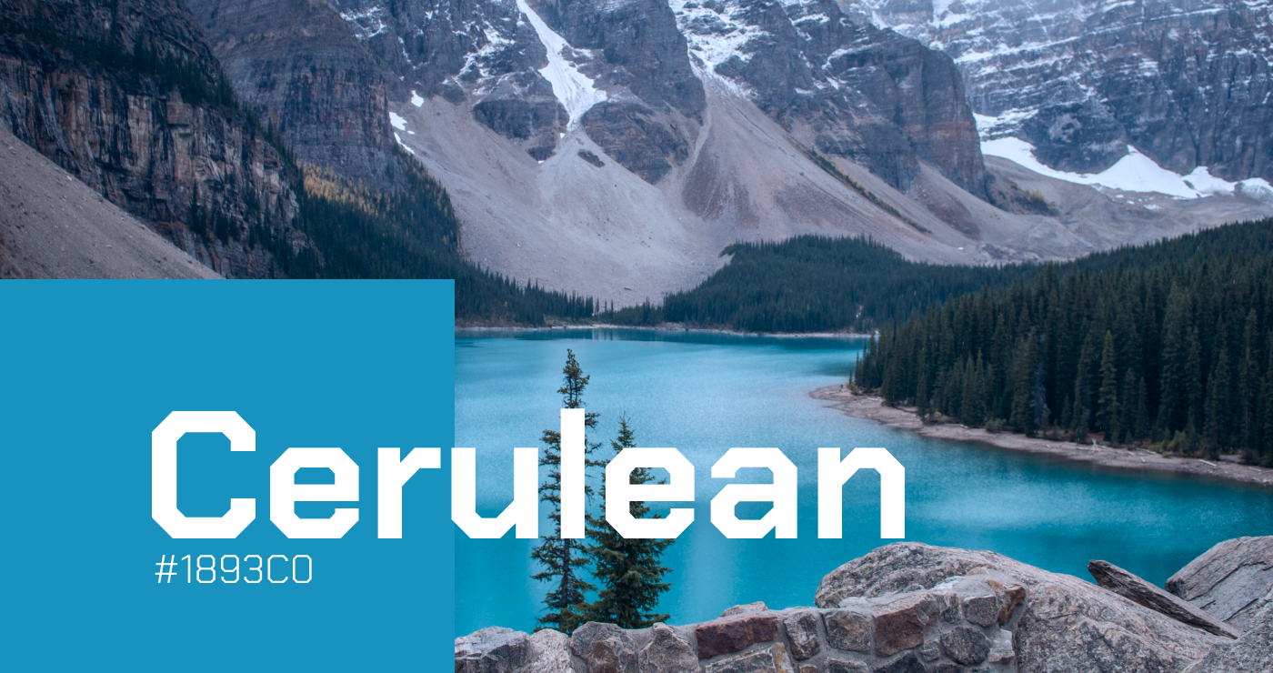
Cerulean blue evokes vitality, energy, and positivity as it is a clear and vibrant color. This color is also associated with calmness and peace. In the financial sector, cerulean blue can be used to reflect technological innovations and the future.
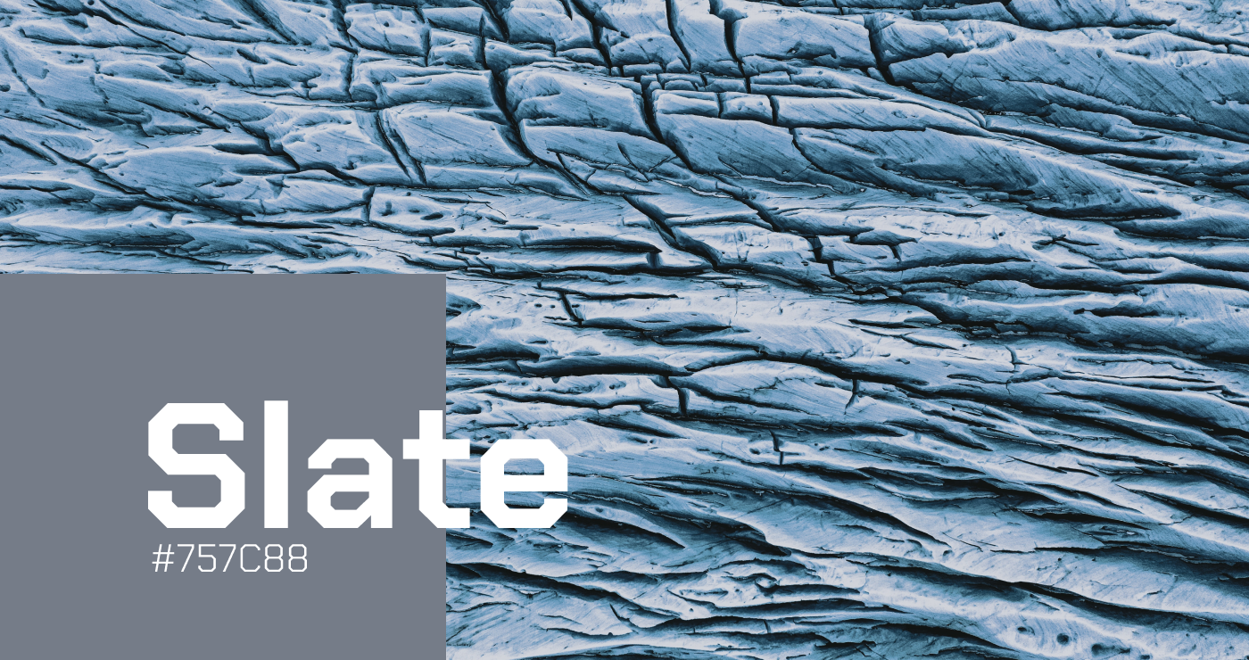
Slate gray is a color that gives a feeling of reliability, seriousness and professionalism. This color is also associated with determination, stability and strength. In the financial industry, slate gray is often used for the corporate identity of financial institutions and banks.
Typography with Intent: Harnessing the Psychological Power of Fonts to Craft RateLink's Impactful Brand Identity
In selecting the ideal font for RateLink's brand identity, I paid close attention to the psychological impact of typography on users, striving to evoke a range of emotions and perceptions that align with the brand's core values. The chosen font is carefully designed to reflect feelings of modernity, warmth, seriousness, determination, confidence, and uniqueness.
Modernity: The font's clean lines and contemporary styling convey a sense of progressiveness and innovation, reflecting RateLink's commitment to staying at the forefront of technology and analytics in the financial sector.
Warmth: Rounded and oval lines in the font's design exude warmth and approachability, ensuring that RateLink's brand is perceived as user-friendly and accessible to a diverse audience.
Seriousness: Straight and sharp lines in the typeface communicate a level of professionalism and seriousness, showcasing RateLink's dedication to providing reliable and trustworthy solutions for financial institutions.
Determination: The font's bold strokes and confident styling embody a sense of determination and purpose, mirroring RateLink's unwavering drive to empower financial institutions through advanced analytics and insights.
Confidence: A well-crafted font instills a sense of confidence in the brand, demonstrating RateLink's expertise and its ability to deliver high-quality, data-driven solutions for its clients.
Uniqueness: By opting for an original typeface, RateLink's brand identity stands out from the competition, emphasizing its distinct approach and reinforcing its position as a leader in the financial analytics industry.
Through the careful selection of a psychologically impactful font, I aimed to create a cohesive and powerful brand identity for RateLink that resonates with its target audience while accurately reflecting the company's values and mission.
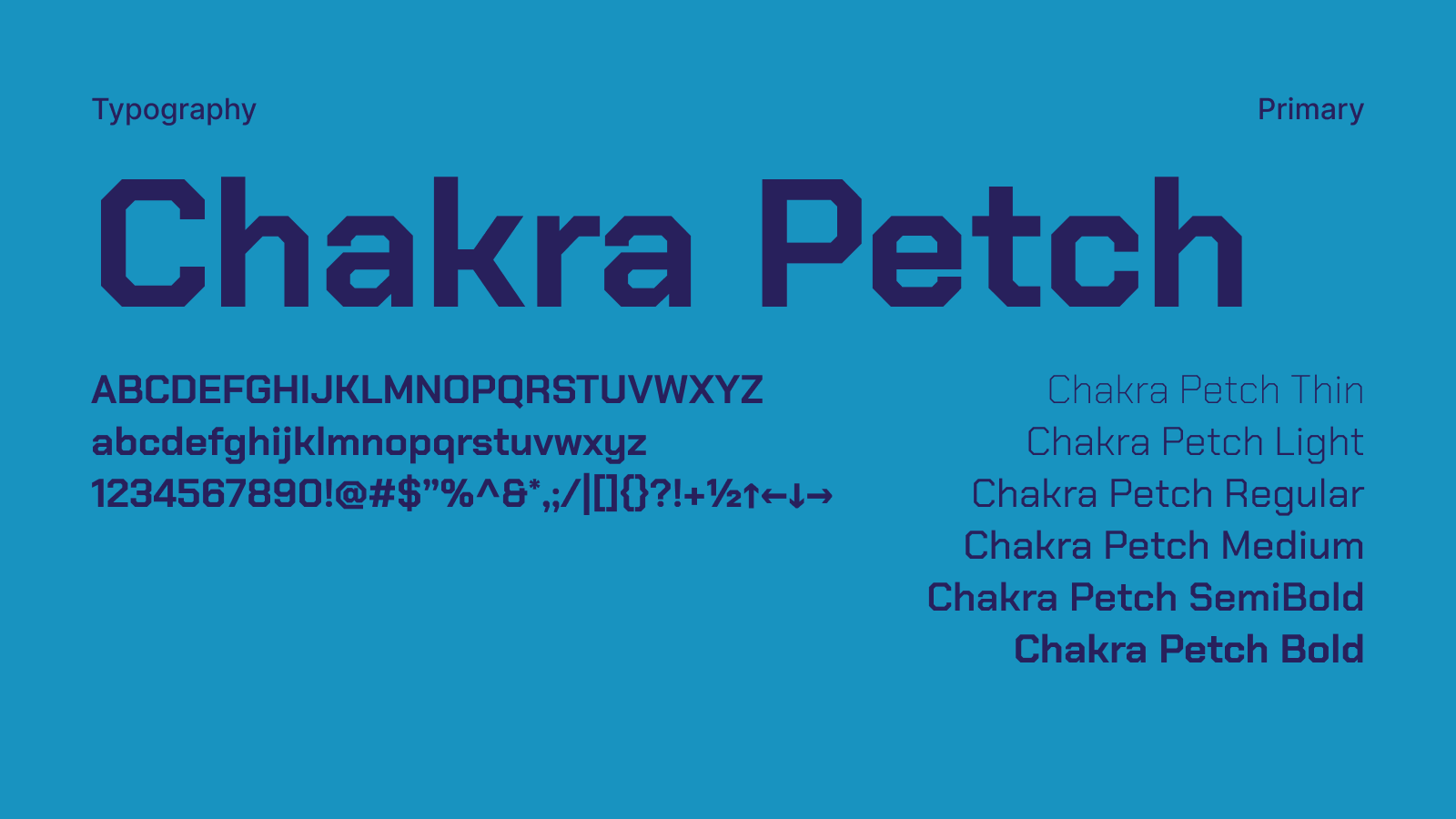
When we look at the psychological effects of the Chakra Petch font, it can evoke positive emotions as it reflects a modern and stylish design. The font can give a feeling of warmth, sincerity and affection with its round and oval lines. However, its straight and sharp lines can also evoke a sense of seriousness, determination and confidence.
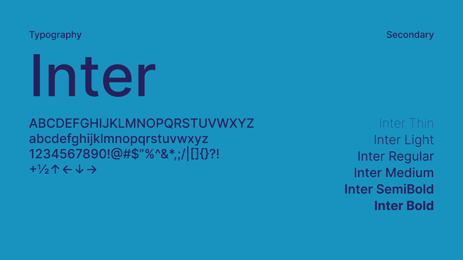
The font Inter is a modern and minimalist font that is frequently used in the financial industry. The font creates a legible and professional look with clean and neat lines. The font is designed specifically for use on digital platforms and is ideal for use on web pages, apps and other digital media channels.
Iconography: Enhancing Brand Identity, User Experience, and Marketing Strategies with Visually Engaging Design Elements
Iconography: Enhancing Brand Identity, User Experience, and Marketing Strategies with Visually Engaging Design Elements
Iconography is a powerful tool that can be employed to strengthen brand identity, promote products and services, and develop effective marketing strategies. By utilizing visually appealing and easily recognizable icons, a brand can ensure a seamless and intuitive user experience across various platforms and touchpoints.
Our icons boast a simple yet impactful design, meticulously crafted to cater to diverse applications and use cases. These versatile icons are available in both large and small sizes to suit various contexts and design requirements, ensuring a consistent brand identity and user experience.
Furthermore, our icon collection offers different styles, allowing for adaptable and user-friendly options that can be integrated seamlessly into a wide range of scenarios. This flexibility ensures that our icons not only resonate with the target audience but also enhance the overall usability and aesthetic appeal of digital platforms, marketing materials, and product interfaces.
By incorporating well-designed and contextually appropriate icons, we aim to:
Reinforce brand identity: Our icons are designed to complement and strengthen RateLink's brand identity, effectively communicating the company's core values and offerings.
Improve user experience: Intuitive and visually engaging icons enable users to easily navigate digital platforms, streamlining their interactions with RateLink's products and services.
Bolster marketing efforts: Eye-catching icons can be integrated into marketing materials to capture the attention of potential clients, conveying key messages in a clear and visually appealing manner.
In summary, our iconography plays a crucial role in building a cohesive and memorable brand identity, elevating user experience, and enhancing marketing strategies. By offering a wide range of adaptable, visually engaging icons, we ensure that RateLink remains at the forefront of innovation and user-centered design in the financial analytics sector.
Grid of various business and data icons in blue and white, including charts, graphs, lock, shield, and network symbols.
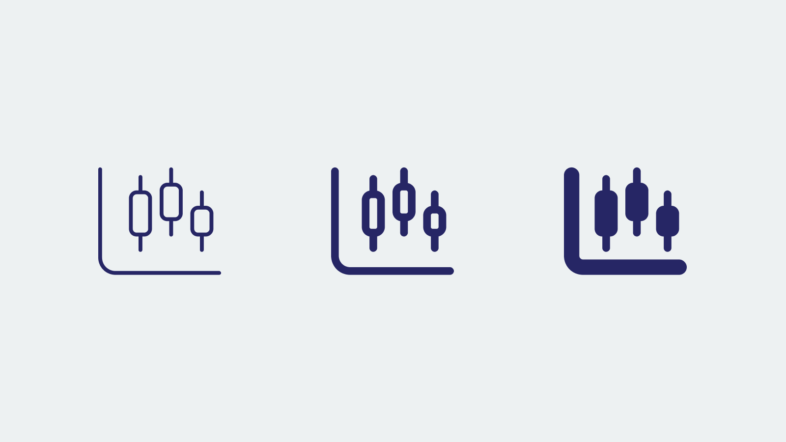
Three stylized candlestick chart icons in blue.
RateLink: A Fusion of Innovation and Trust - Crafting a Compelling Brand Identity for the Future of Financial Analytics
Our logo is meticulously crafted to project a modern, agile, and corporate image that embodies RateLink's core values. The primary color, indigo blue, is a popular choice within the financial sector, invoking a sense of professionalism, dependability, and credibility. Complementing the indigo blue are auxiliary colors cerulean blue and slate gray, which add a layer of vibrancy, technological innovation, and trustworthiness to the overall design.
The Chakra Petch font is employed as the logo's typeface. This modern and stylish font emanates warmth and approachability through its rounded and oval lines, while its straight and sharp strokes convey seriousness and confidence. As an original typeface, Chakra Petch also imparts a sense of distinction and uniqueness, setting RateLink apart from competitors.
The geometric shapes incorporated into the logo design represent RateLink's commitment to advanced analytics and data-driven solutions. The interconnected elements symbolize the platform's ability to seamlessly integrate various data sources, providing a holistic view of the financial landscape. These shapes also contribute to the overall contemporary and forward-thinking aesthetics of the logo.
The synergy between the logo's design, typeface, and color palette aims to encapsulate key attributes such as professionalism, reliability, technological innovation, and differentiation. Through these carefully considered design elements, RateLink's logo effectively communicates its brand identity and solidifies its position as a leading provider of data analytics solutions for the financial sector.

RateLink logo with blue arrows on a white background.
RateLink logo on a blue background

Two identical arrow logos, one on a dark blue background and one on a light blue background, each consisting of two overlapping blue arrows pointing right.

Screenshot of RateLink web interface showing file listing page with sidebar menu and browser tab with URL ratelink.com.

RateLink logo with blue arrows and text "Powered by Linktera."

RateLink logo with text 'Powered by LINKTERA' on blue background.

Abstract blue wavy background with text overlay, "Advanced Analytics for Connected Data: The Future of Financial Reporting and Analysis." Navigation links and "RateLink" logo visible.

Website homepage for RateLink showcasing advanced analytics for connected data with a modern design and navigation menu.
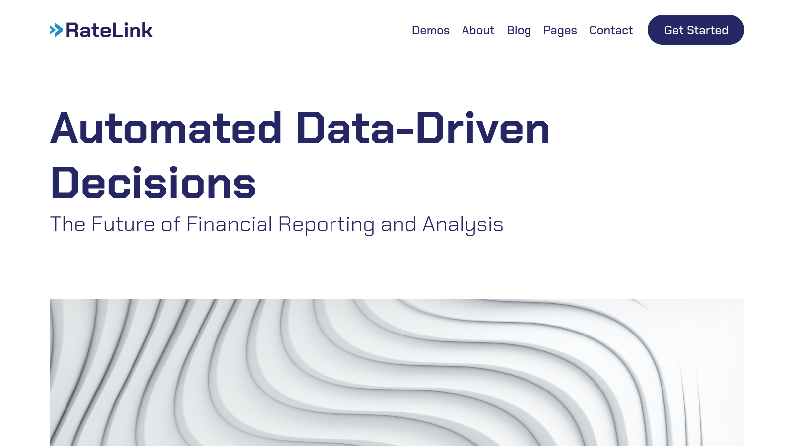
Website banner for RateLink with text 'Automated Data-Driven Decisions' and 'The Future of Financial Reporting and Analysis'. Features a wavy pattern graphic and navigation links such as Demos and Blog.
The Results: Crafting a Cohesive Brand Identity for RateLink - Enabling Financial Institutions to Thrive with Advanced Analytics
As a designer, I take pride in developing visually engaging and meaningful brand identities that resonate with the target audience. For RateLink, I was entrusted with the responsibility of creating a logo and brand book that effectively communicate the project's essence: empowering financial institutions through advanced data analytics. Through my work, I aimed to capture the core values of innovation, expertise, and trust that RateLink represents.
—A Symbol of Innovation and Trust
The RateLink logo is designed to be a powerful symbol of the brand's commitment to innovation and trust. The clean lines, modern typography, and bold color palette reflect the cutting-edge nature of RateLink's analytics solutions, while the interconnected elements convey a sense of stability and reliability. This carefully crafted logo serves as an instantly recognizable visual representation of RateLink's mission and values.
—The RateLink Brand Book: A Comprehensive Guide
To ensure consistency and coherence across all aspects of the RateLink brand, I created a comprehensive brand book that serves as a detailed guide for all future branding endeavors. This brand book covers everything from typography and color schemes to logo usage and design principles. By providing clear guidelines and best practices, the RateLink brand book ensures that the brand's visual identity remains cohesive and true to its core values.
—Visualizing Data-Driven Solutions
A key aspect of my work on RateLink was to visually represent the advanced analytics solutions that the brand offers. Through the use of custom graphics, charts, and diagrams, I showcased the power of RateLink's data-driven approach, making it easier for potential clients to grasp the benefits and value of the platform. This visual approach not only enhances the overall brand experience but also helps communicate complex concepts more effectively.
—Global Appeal
Understanding that RateLink serves a diverse range of financial institutions across the globe, I designed the brand identity with a universal appeal in mind. By combining modern design elements with a clear, straightforward message, the RateLink brand is able to resonate with a global audience and convey its commitment to innovation and reliability.
The results of my work on RateLink's logo and brand book showcase the power of cohesive design and effective visual communication. By creating a strong brand identity that reflects the core values of innovation, expertise, and trust, RateLink is well-positioned to make a lasting impact on the financial institutions it serves, driving their success through advanced analytics and insights."
Recommended Reads: Essential Books on Color Psychology, Branding, and Design
"Logo Design Love: A Guide to Creating Iconic Brand Identities" by David Airey
This book covers the process of creating effective brand identities, including the role of color psychology in logo and brand design.
"The Elements of Color: A Treatise on the Color System of Johannes Itten" by Johannes Itten
This foundational text delves into color theory, exploring the interactions and psychological effects of colors in depth.


 Let’s Talk